

The Do Good Challenge
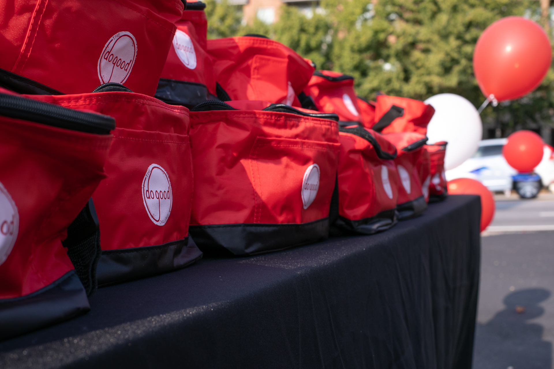
Eager to see the need for more good done in our own communities fulfilled, Orchard (an Atlanta-based nonprofit that supports smaller nonprofits) created a remarkably easy 24-hour challenge full of random acts of kindness and other fun, creative ways to engage with the world around you.
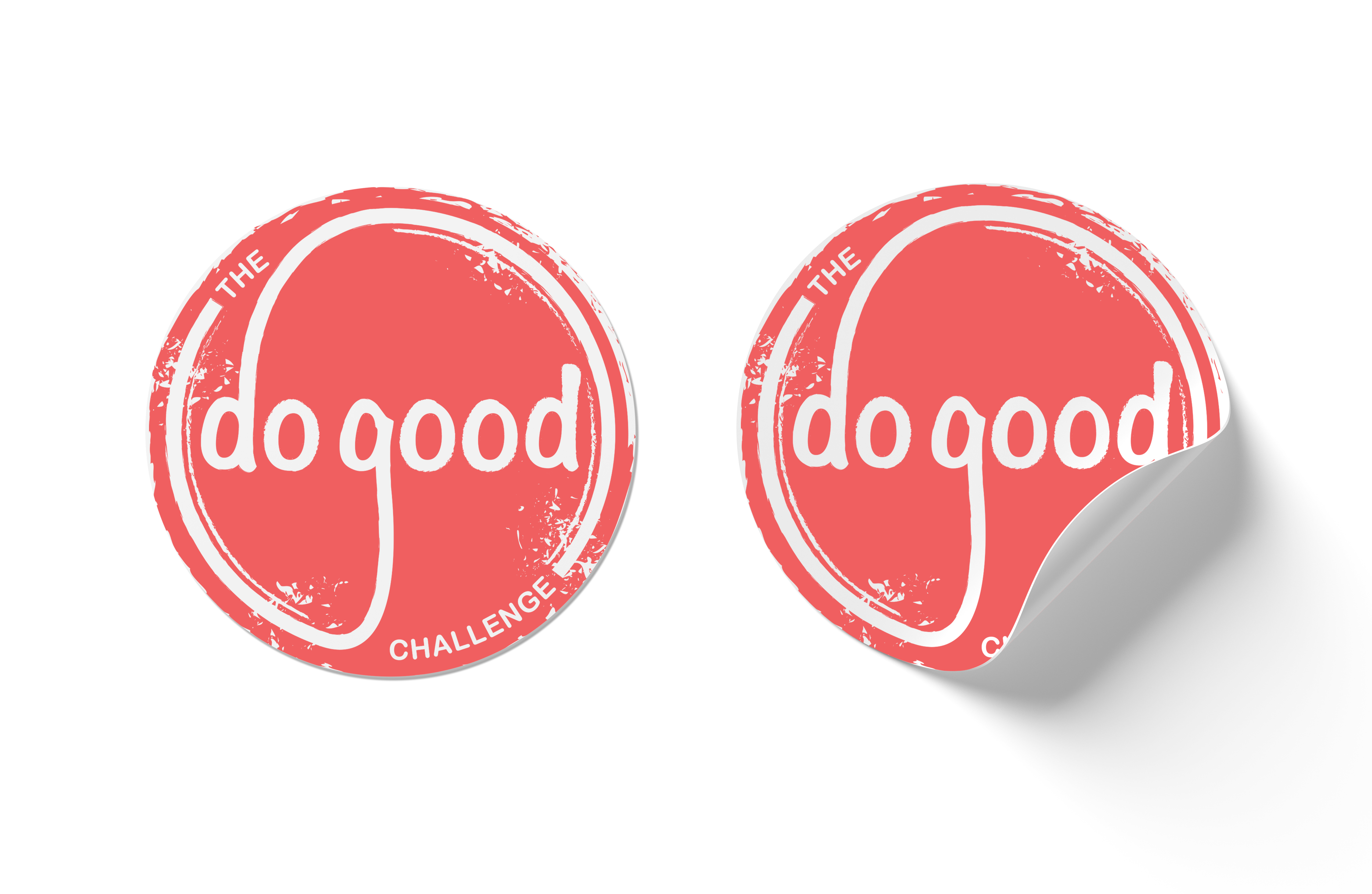
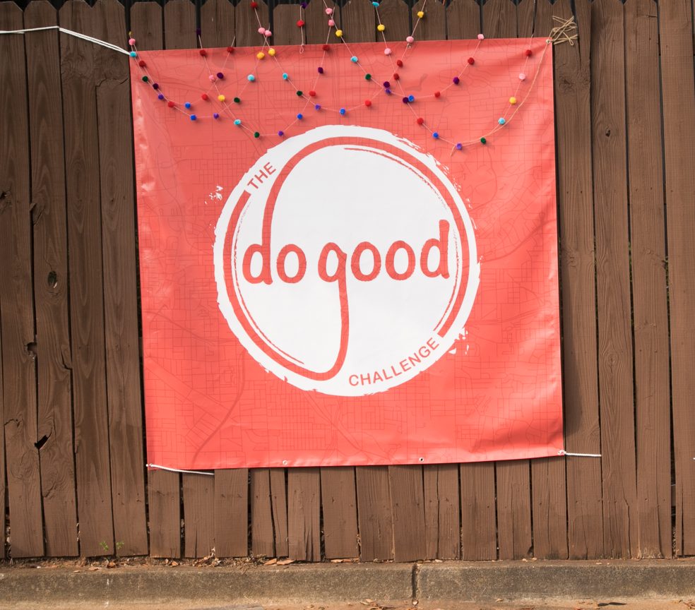
With this campaign, the three main colors, yellow, blue, and red, all speak to the energetic fun of summer, the season of the annual Do Good Challenge.
The colors, fonts, and grunge effect on the logo reflect the excitement and youthful energy of such an active event. The arrows and background map overlay both speak to the nature of the challenge being part scavenger hunt in the city.

One Step
One Step is an initiative to get churches and individuals all over the world to take “one step” towards helping others.
Since the audience is working adults with a desire to serve, the look and feel is professional and dignified. The simple, yet energetic logo, speaks to the action the initiative wants you to take – “one step” out of your comfort zone to help others.

Hope For Tomorrow
Hope For Tomorrow is a summer-long campaign that highlights and celebrates nonprofits, who serve the most economically vulnerable of their communities.
The color choices reflect the fun of the Summer (the season of the campaign), while maintaining a professional feel to cater to the working, professional stakeholders.
The logo is simple and the hidden arrow speaks to the goal of uplifting the vulnerable. Even the lower-case lettering of the word “hope” brings to mind the unassuming nature of those who need our help the most.
